A new visual identity and website for Gnist, a youthful consultancy focused on sustainable development in the tourism industry.
Gnist, a dynamic and innovative company, sought to establish a strong visual identity that reflected their youthful and energetic spirit while maintaining a professional appearance.
This case study explores the design process and outcomes achieved through the creation of Gnist’s logo, brand identity, and website.

Goals & Objectives
- Define Gnist’s identity: Gain a deep understanding of Gnist’s values, goals, and aspirations to effectively capture their essence through design.
- Youthful and energizing aesthetic: Create a visual identity that conveys Gnist’s vibrant and dynamic nature.
- Professional appearance: Balance the energetic elements with a sense of professionalism to ensure credibility and attract a diverse audience.

Design Process
Discovery and Research
Conducted in-depth discussions with the Gnist team to understand their vision, target audience, and industry. Explored their goals and aspirations to establish a strong foundation for the design process.
Concept Development
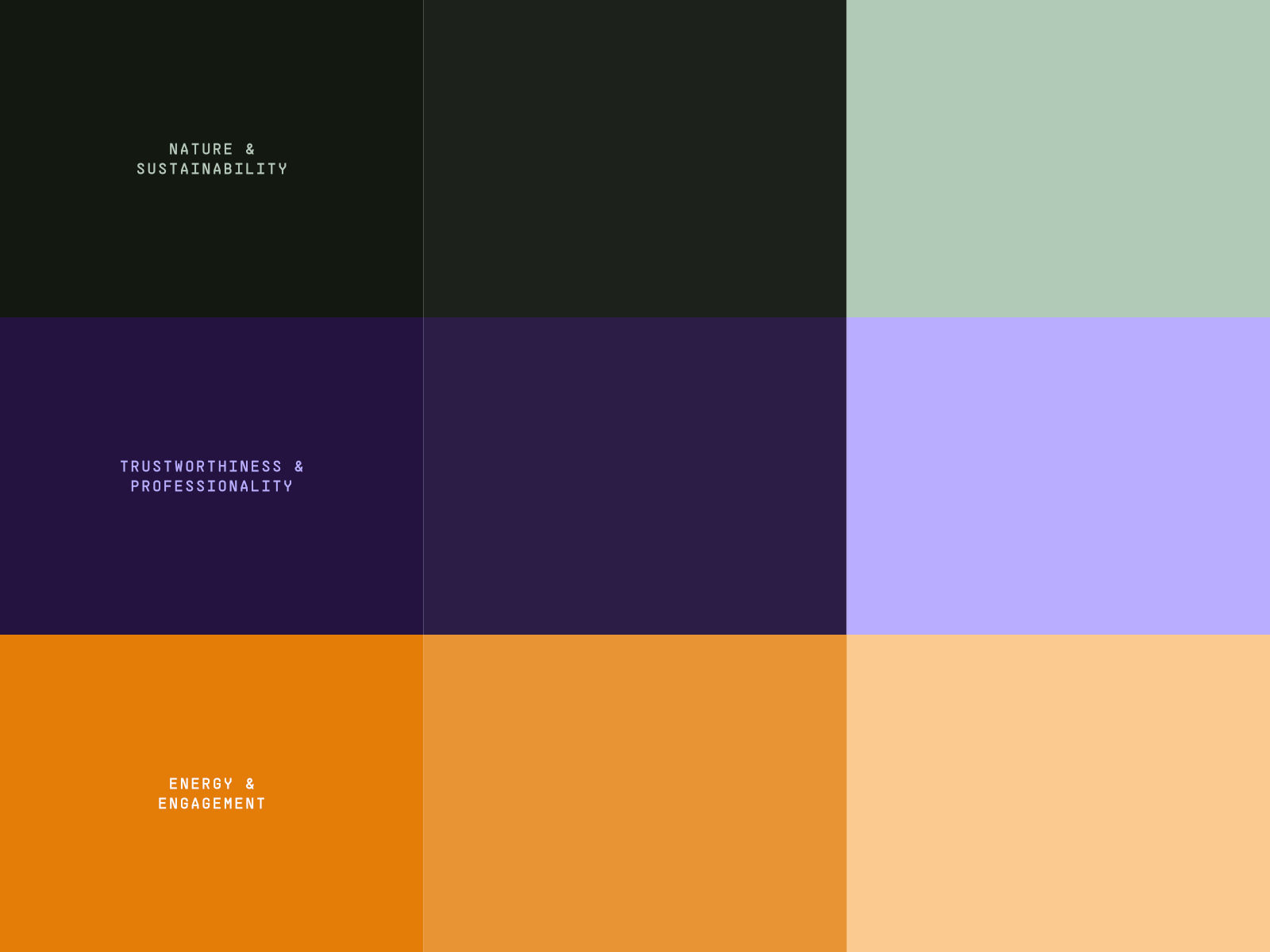
Brainstormed and generated multiple design concepts, focusing on capturing the youthful and energizing essence. Explored various color palettes, typography styles, and graphic elements to find the perfect balance.
Logo and Brand Identity Design
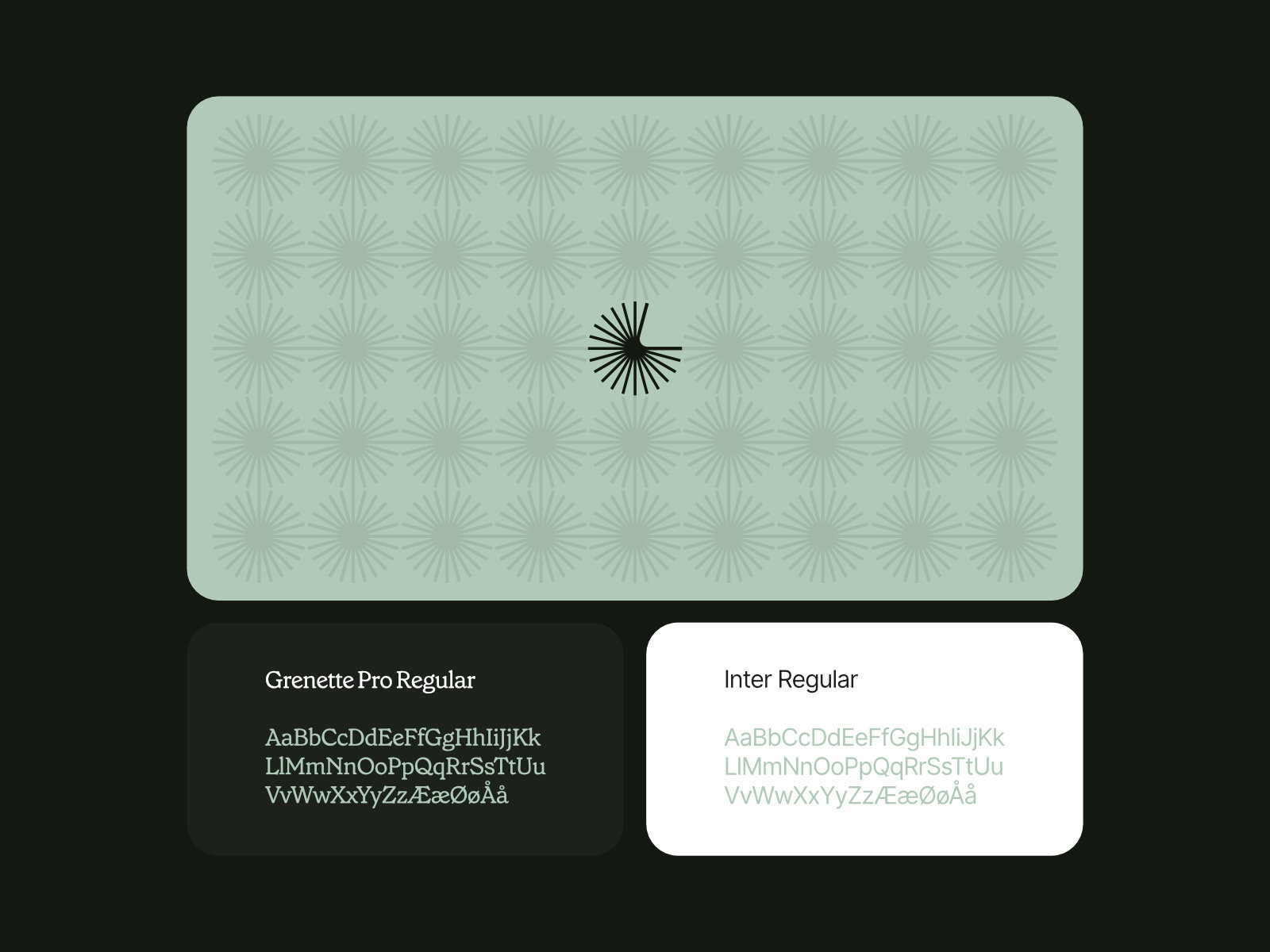
Developed a versatile and memorable logo that combined bold typography and a dynamic icon. Created a comprehensive brand identity system, including color schemes, typography guidelines, and supporting graphic elements, to ensure consistency across all brand touchpoints.
Iterative Design
Collaborated closely with the Gnist team, refining and iterating on the chosen design concept. Incorporated their feedback to ensure the final designs aligned with their vision and objectives.
Website Design
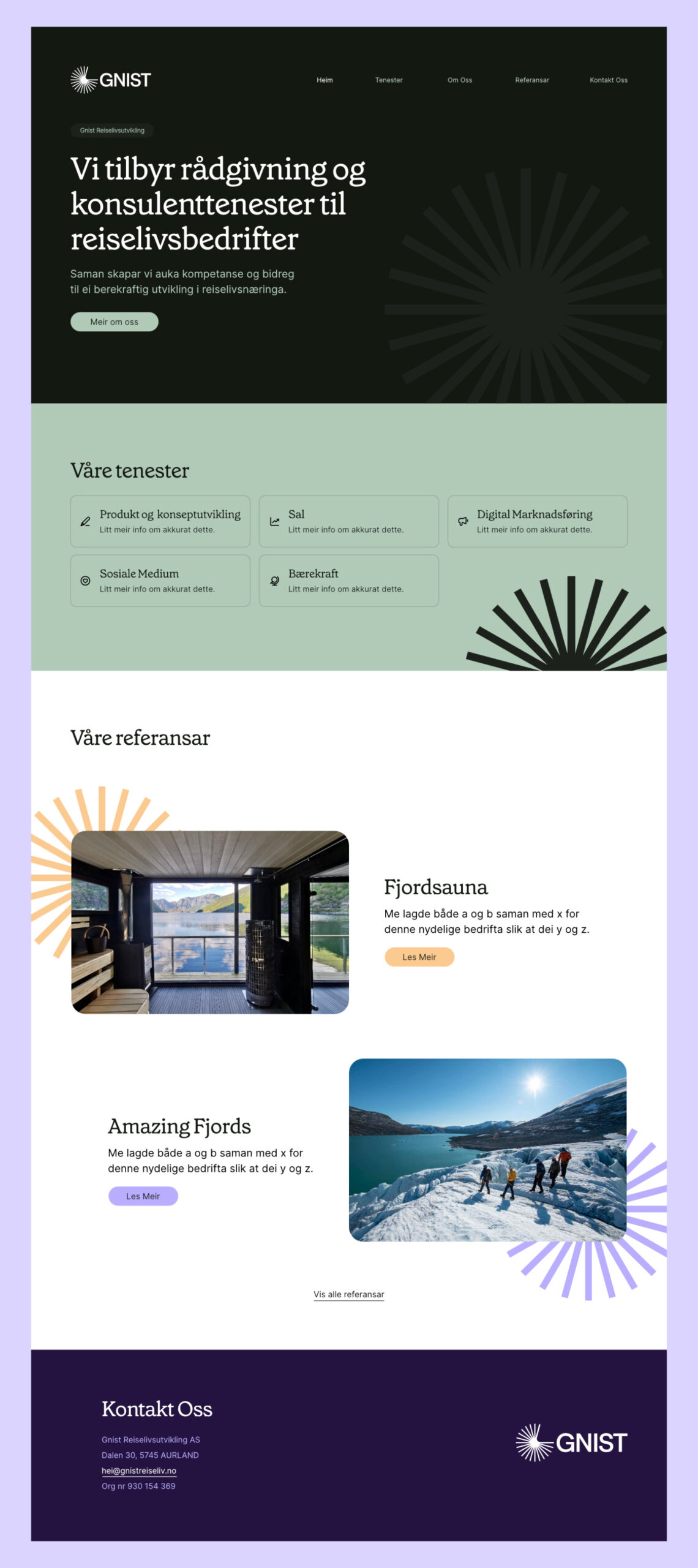
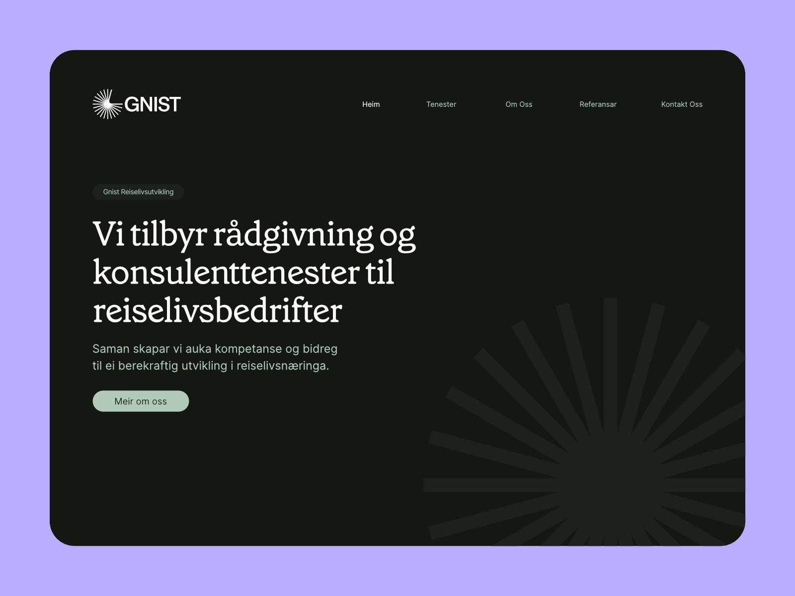
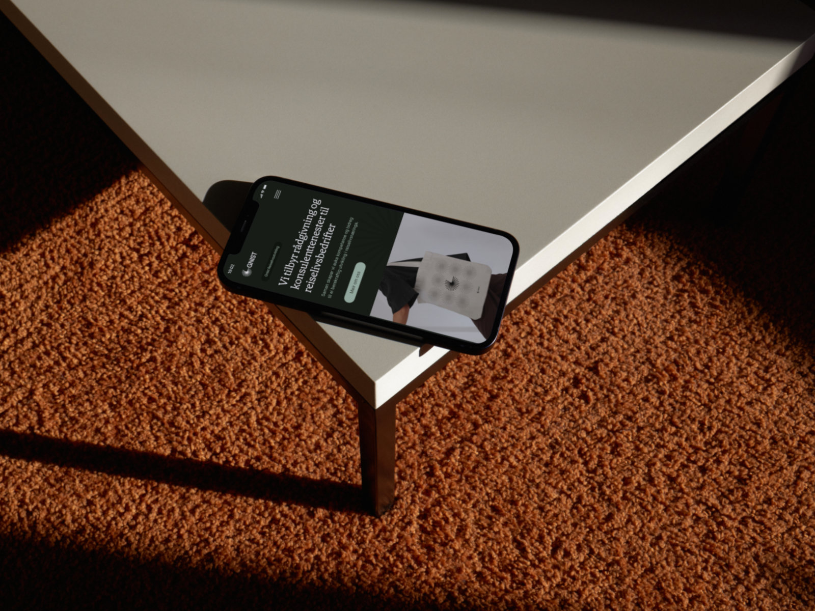
Translated the brand identity into a captivating and user-friendly website design. Leveraged modern design principles, intuitive navigation, and engaging visual elements to create an immersive digital experience for Gnist’s target audience.
Results
The design deliverables for Gnist successfully captured their desired youthful and energizing brand image while maintaining a professional appearance.
Key outcomes include:
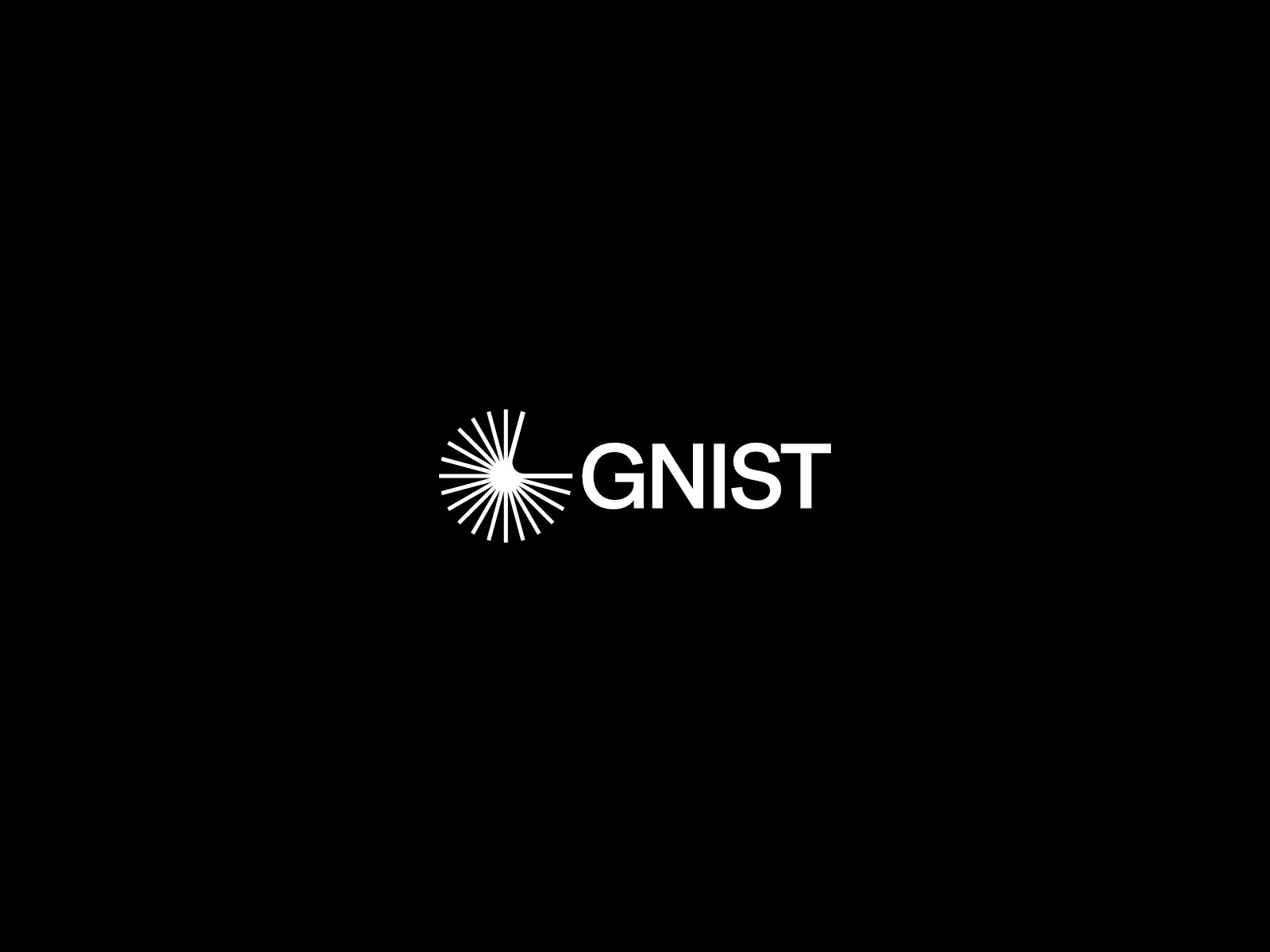
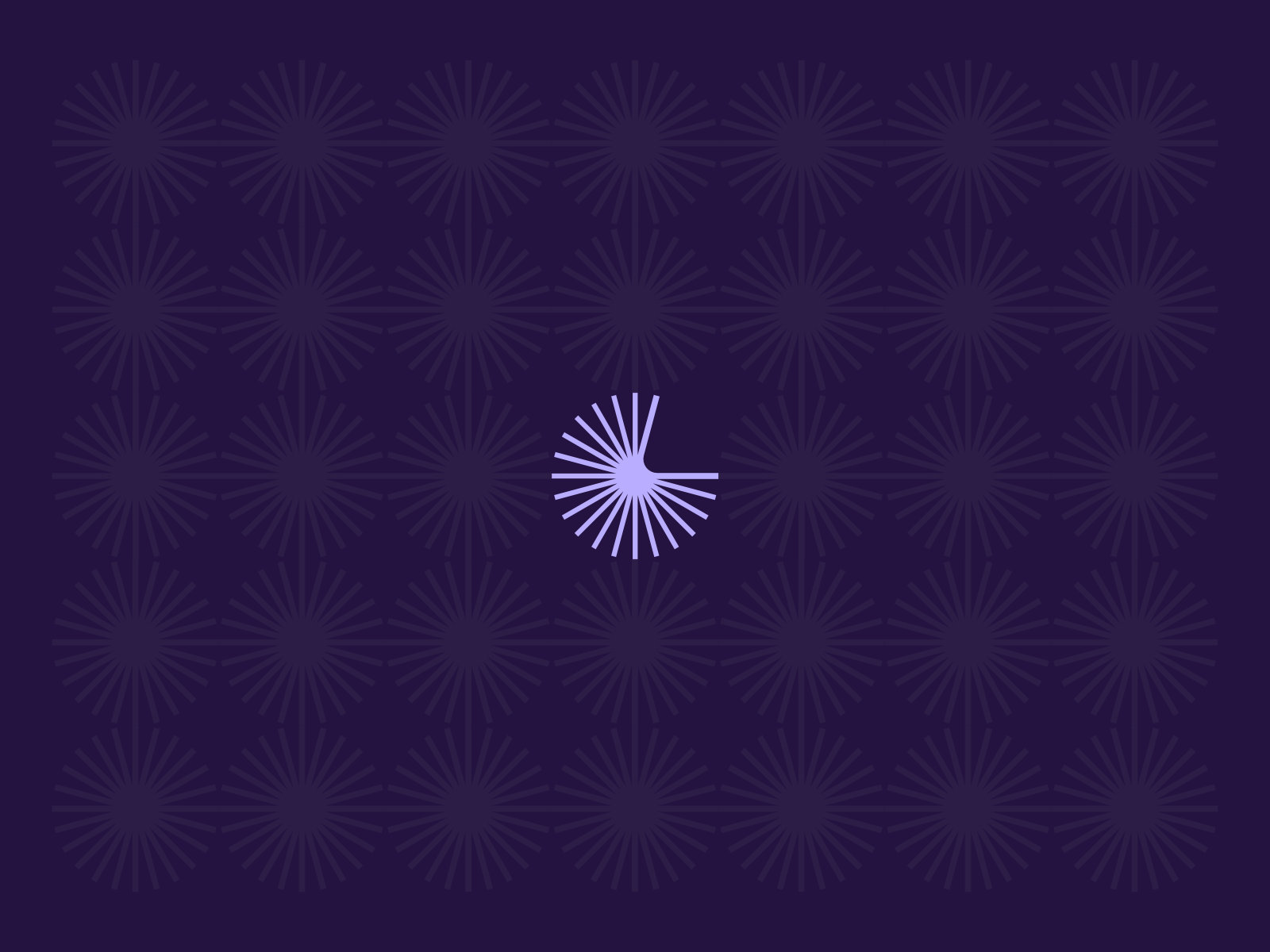
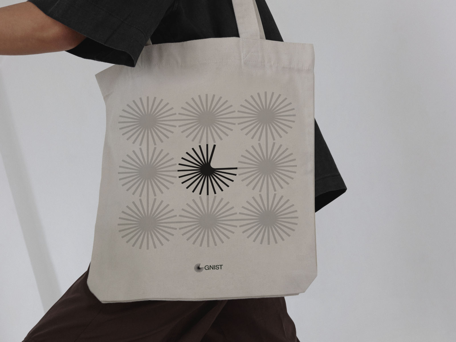
- Memorable Logo: Gnist is the Norwegian word for spark. The finalised logo symbolises engagement, insight, development and is a flower, spark and an eye neatly combined with the letter G. The logo is unique and instantly recognisable while representing Gnist’s vibrant spirit.
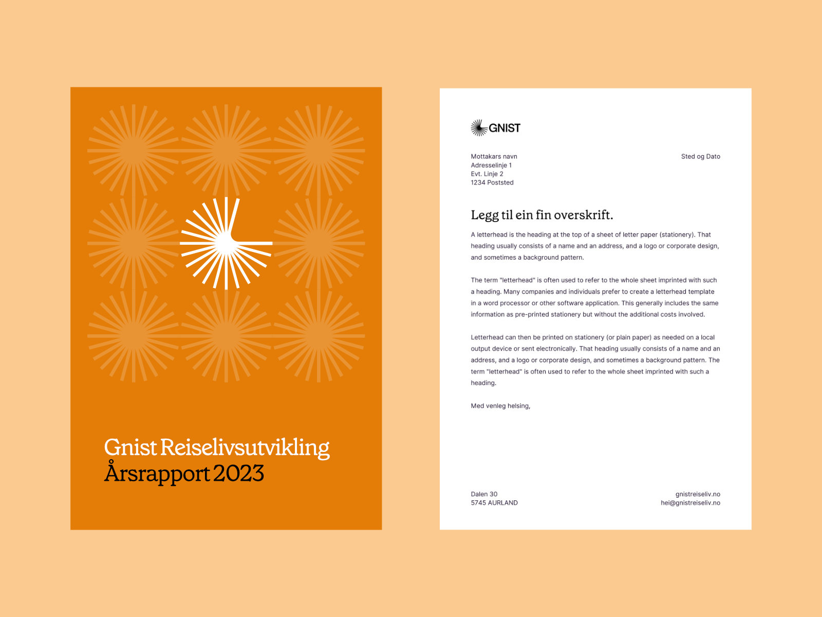
- Consistent Brand Identity: The brand identity system and brand guide established a cohesive visual language. Paired with a boatload of templates in Canva we ensured consistent application across various mediums, including stationery, marketing collateral, and digital platforms.
- Engaging Website: The website design showcased Gnist’s services, and values in a visually appealing and user-friendly manner. The immersive experience is sure to leave a lasting impression on visitors and encourage exploration.
- Increased Brand Awareness: The new visual identity helped Gnist stand out in their industry and attract attention from their target audience. The design elements effectively communicated their unique offerings and values, contributing to enhanced brand recognition and customer engagement.